


The Color Grading panel in Lightroom offers a powerful set of tools for tweaking the color balance of your images to perfection. But if you’re unfamiliar with the concept of split toning, getting to grips with the numerous Lightroom Color Grading features can seem like a daunting task.
Fear not, in a series of clear and easy to follow steps, this guide explains everything you need to know in order to master split tone colour grading in Lightroom.
Lightroom Color Grading Explained
If you’d prefer to watch this tutorial rather than read, then watch the video below!
Who Stole My Split Toning?
With the arrival of Lightroom 10.1 in 2020, I realized that I couldn’t find the Split Toning tools anymore. And I wasn’t alone; suddenly the internets echoed to the sound of enraged photographers wanting to know where the Split Tone function had gone.
As it turns out, it hadn’t gone anywhere. Split Toning had simply been reintroduced as a new feature called Color Grading. “New” only in the sense that the name and layout had changed. In terms of functionality, however, Color Grading is almost identical to the old Lightroom Split Tone tools. In fact all that’s changed is that the “split” is now three-way – lows, mids, and highs – rather than just two.
About a year has passed since then, so by now most experienced Lightroom users will have worked out where to find the split toning controls. But if you’re relatively new to Lightroom, or simply haven’t delved into split toning techniques before, it’s high time you shifted your color work up to the next level by getting to grips with the Lightroom Color Grading panel in all its complexity.
And if that’s you, well, you’re in luck, as this comprehensive guide to color grading explains everything you need to know about how to do split toning in Lightroom.
Bring it on!
And if you want to speed up your Lightroom Workflow, then download my free Lightroom Hotkeys guide!
What Is Split Toning?
Simply put, Lightroom’s newly rebranded split toning tool separates the high, mid, and low areas of the color spectrum (unlike the HSL panel, which separates individual colors), and allows you to adjust the colour balance of each of these independently of each other. In practice, then, you’re now free to add a tint of whatever colour you fancy to the highlights, mid-tones, or shadow areas of your photos.
That’s all very well, but why would you want to do that? Surely it would just make the colours look unnatural?
Actually, it’s often the opposite. Light is naturally split toned to some degree. And split toning can sometimes be the only way to accurately recreate what you saw at the time of shooting – as opposed to what your camera saw.
Split toning is also essential if you want to recreate an analog film look in the digital world. It’s only part of the story of course, but dialing in a slight colour cast to different tonal areas of an image can go a long way towards conjuring up some of the magic of photographic chemistry.
How to Use Split Toning in Your Photography
When it comes to colour grading, one of the most common problems I see with new photographers is that they don’t have a clear goal in mind before starting work. Instead they just move sliders around at random until they find something they like the look of, but without having any clear reason for making those edits.
I believe that anything you do to your photos at the editing stage should have a clear purpose. Something more than merely “because it looks cool.” Instead, every edit should advance your image towards its final goal; hammering home what you want to communicate with that particular photo.
Want to speed up your Lightroom Classic workflow? Grab my FREE Lightroom Hotkeys guide now!
Look on colour grading as a form of storytelling. By combining well-chosen lighting techniques with split toning, you create a series of visual clues that suggest to the viewer a particular time of day. Perhaps even a season or a place; the cold light of a northern forest in winter, for example, compared to the warm glow of sunset on a tropical beach.
Think about how warm the color of golden-hour sunshine is vs late afternoon shadows. This is real life split toning, and it’s especially noticeable if you ever shoot against the light at the end of the day. Golden-hour and blue-hour effectively overlap, so for a while you get a lot of red and yellow in the highlights and blue or cyan in the shadows – with the amount of cool blue shadow areas increasing as the sun sinks below the horizon.
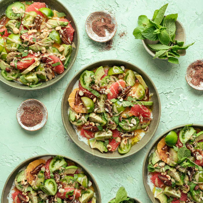
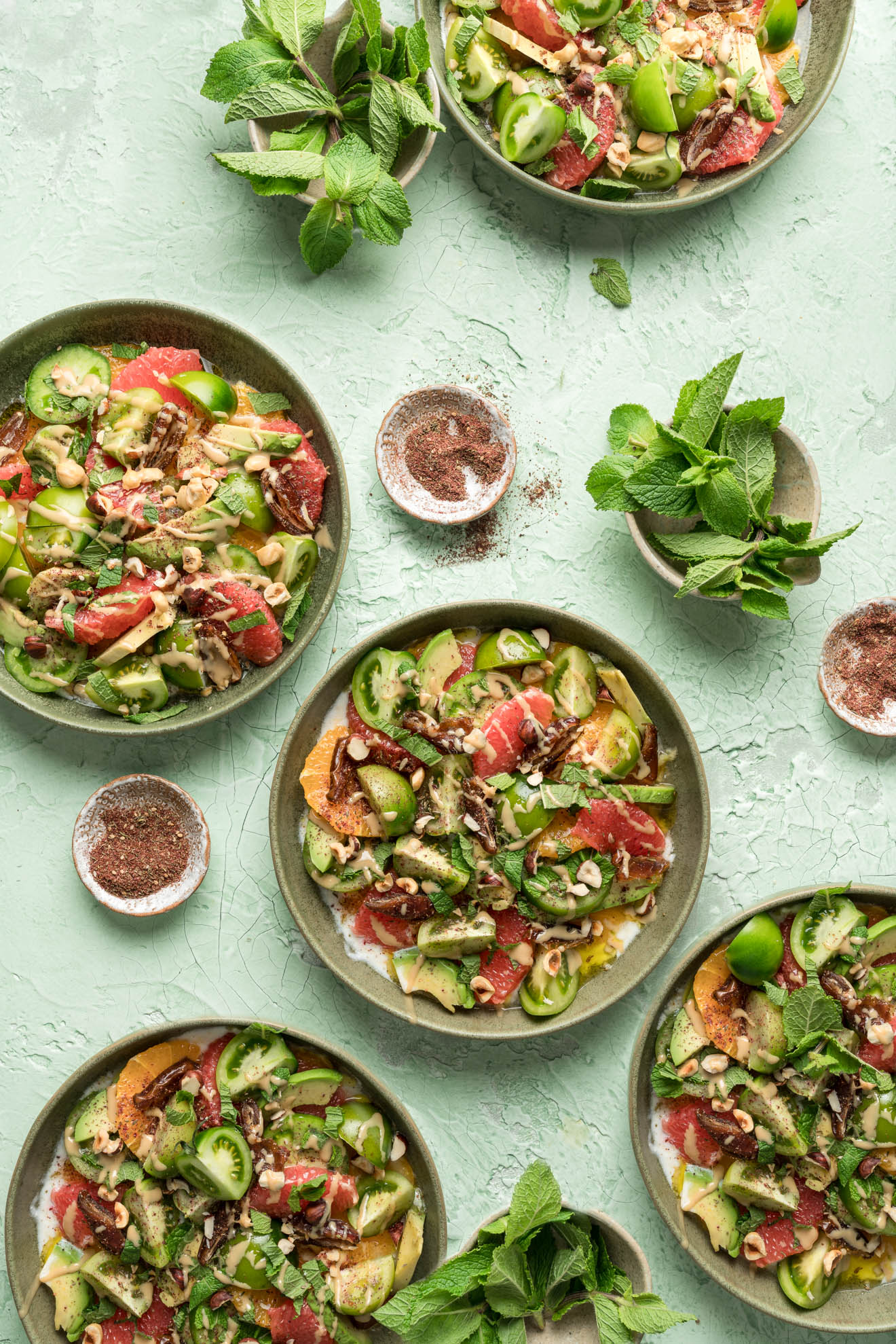
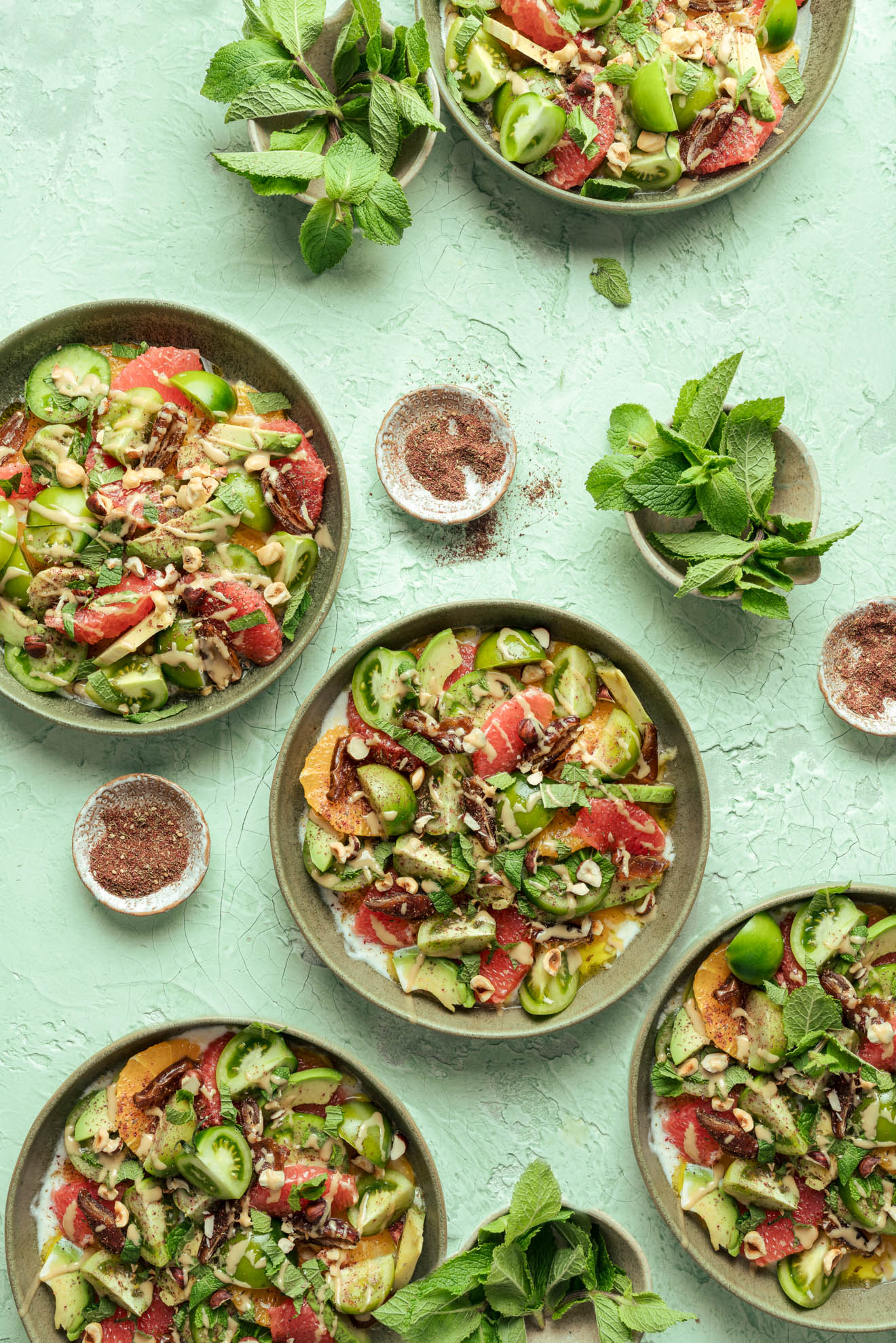
That’s the look we’re going for today – the last minutes of golden-hour – in the hope of turning a slightly sterile artificially-lit studio shot into a glowing and atmospheric mini-masterpiece, of sorts.
Let’s get down to it!
Lightroom Color Grading Tutorial
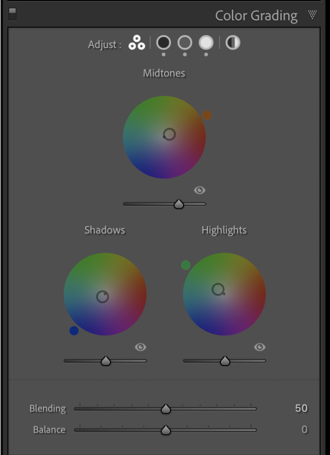
Open up the Lightroom Color Grading window and you’re presented with three colour wheels; one each for the shadows, mid-tones, and highlights. At the most basic level, split tone editing could just mean selecting a colour on each of these wheels and leaving it at that. But for those willing to put in the effort, Lightroom’s Color Grading controls permit much greater fine-tuning than this.
As I said earlier, in this tutorial I’m working with an image I shot in the studio using artificial lighting, but with the goal of making it look more like it was shot using daylight in the late afternoon. Typically that kind of lighting will produce cool shadows and warm highlights, with the colour of the mid-tones being somewhat dependent on the exact environment and lighting situation.
That being the case, I’m going to quickly dial in a touch of blue and cyan to the shadows, and add green to the highlight areas. to bring out the backdrop I’m also going to warm up the mid tones a little, but we may want to change this later.
When selecting a colour on the colour wheel, you’ll get greater saturation (i.e. purer colour) at the edge of the wheel, and a less saturated tone the closer you get to the centre. Conveniently, you can lock a saturation setting in place by clicking on it while holding down the Command key. This will allow you to fine tune the exact shade of color, without accidentally changing the degree of saturation. Alternatively, holding down Shift will keep the color locked, while allowing you to tweak the saturation.
There’s also a slider under each colour wheel that adjusts Luminance; which in practical terms means how bright or dark the colour is. So, for example, if we adjust the Luminance slider for the mid tones, we can brighten or darken just the mids without changing the density of either the highlights or the shadows.
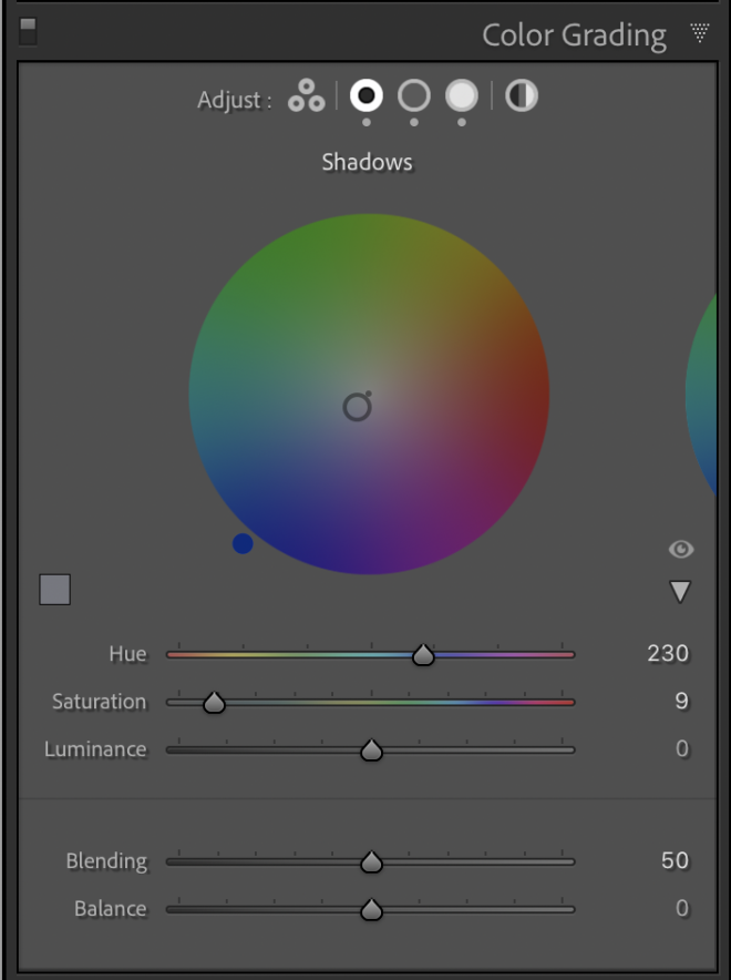
For greater precision, you can open up a dedicated colour wheel for either lows, mids, or highs by clicking one of the three circular buttons at the top of the Color Grading window. Not only do you get a bigger wheel to work with this way, but there are also sliders for Hue and Saturation – which some people find easier to control than adjusting these settings via the colour wheel itself.
Next to the three buttons for lows, mids, and highs, there’s a fourth circle that brings up a dedicated colour wheel controlling the global tint of your image. But given that we’ve just gone to the trouble of dialing in the perfect split tone colour grade for our photo, you might be wondering what the point of a global colour wheel is.
In actual fact it’s pretty useful, as it allows us to shift the overall colour balance of an image without changing the colour relationships between the lows, mids, and highs. So in our case, although we’ve set the shadows to have a somewhat blue and cyan tint, the mids to be warmer, and the the highs to be quite yellowish, we can make subtle changes to the overall tone of the image – for example, making it globally warmer or cooler – while retaining the contrast between these individual areas.
Okay, so now I’ve got my image looking roughly how I want it in terms of atmosphere, it’s time to dive a little deeper into Lightroom’s Color Grading controls.
At the bottom of the Color Grading window, you’ll find the Blending and Balance sliders. The first of these is used to determine how much your highlight, mid, and shadow areas overlap. If that’s unclear, try thinking of the lows, mids, and highs as three distinct bands. Setting the Blending slider all the way to the left will keep these three bands as quite separate color zones, whereas sliding to the right will effectively make the three bands bleed into each other at the edges.
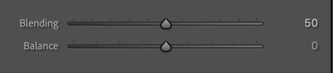
In practice, then, the Blending slider allows you to tell Lightroom how smooth or hard the transition between low, mid, and highlight areas should be. This is useful if you want to keep the color tints you add to each zone quite separate; for example by adding reds to the shadows to create a deep and warm glow, while making sure that the rest of the image remains quite cool in tone. Alternatively, by sliding all the way to the right, you can make the transition between shadows and mids much less abrupt, so that the warm shadows slowly fade into cooler mids.
The Blending slider is best adjusted in a kind of back and forth process with the Balance slider. And while the Blending slider determines the transitions between bands, the Balance slider is used to set the relative size of each band; i.e. how much of the image should be treated as either shadows, mids, or highlights.
To see this in practice, make sure you watch the video tutorial at the top of this post!
What you’re effectively doing when you adjust the Balance slider, then, is changing the size ratio between the bands. With the slider set to the centre, the three bands are of equal width; but slide the controls to the right or left, and the balance shifts in favor of more highlights or more shadows respectively.
And if, for example, the shadow band grows in size, it will start to encroach on the chromatic space where the lower mids where earlier. Now, because our shadows are cool, moving the Balance slider so that the shadow band is bigger than the mids and highlights will result in an image that is cooler overall.
Want my top tips for making your Lightroom Classic workflow more efficient? Then grab my free Lightroom Hotkeys guide below
Grading for an Analogue Film Effect in Lightroom
Let’s say you wanted to achieve the colour palette of analogue film but on a digital photo. One way that Lightroom’s Color Grading panel can help you to achieve this is by letting you analyze, and then copy, the split toning of a reference analogue photo. By which I mean you can import a scanned film image that you like, and then sample the tones from its shadow, mid, and highlight areas so that you can use them in your own image. I chose this image from Unsplash.
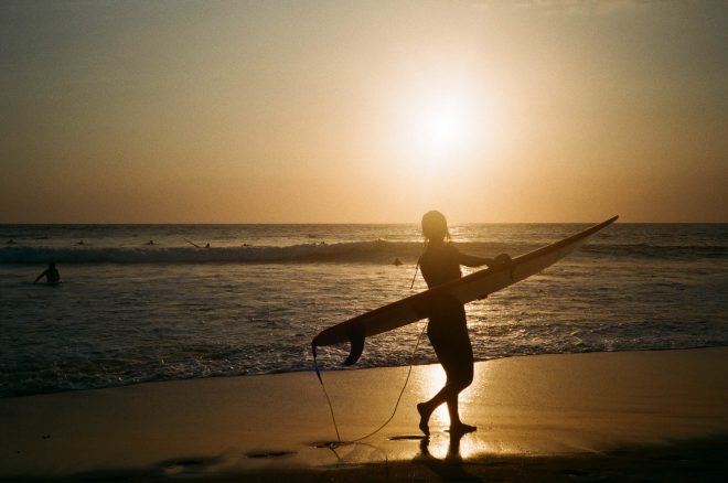
This can be done by clicking on one of the bigger colour wheel views at the top of Lightroom’s Color Grading window like we did earlier – let’s do the shadows first – and then checking the small Custom Color box to the left of the wheel. Now choose the Eye Dropper tool, and drag it over your example film image to sample the color of the shadow areas; you’ll see the position of the colour selector on the colour wheel change as you do this.
Once you’ve found a shadow colour in the source photo that you like, click on it so that it shows up in the Custom Color palette, and then select an empty spot in the palette. Right click, and choose “set swatch to current color” to save this colour for future use. Do the same for the mid and highlight areas of the analogue image, too, sampling a shade that you want to use for the mids and highs of your own photo. Now apply these colors to your own photo and you should be somewhere in the ballpark in terms of tone.
Of course, this technique won’t immediately make your photos look exactly like they were shot on film. And you’ll likely need to tweak the settings slightly to find a result you’re happy with. But they will at least get you half way there in very little time. You can copy and save these settings as a preset, too, so that in the future they can be applied to other images with a single click.
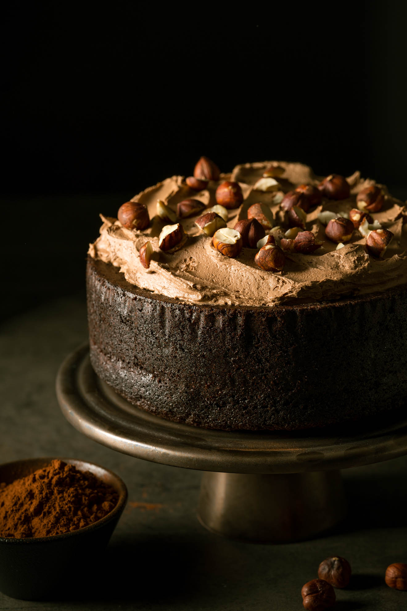
Here’s the final results of my chocolate cake image:

Final Thoughts
As we’ve just seen, split toning can really be the icing on the cake as far as image editing goes; transforming a photo from merely good to great. And even helping to recreate the look of analogue film to a certain extent – if that’s what you want.
With a solid understanding of how to use split toning techniques now firmly under your belt, you’ll likely find that you reach for Lightroom’s Color Grading feature with every image you edit.
How have your experiences been of the revised Lightroom Color Grading tools? Do you find that working with three-way split toning makes a significant difference to the results you can get out of Lightroom? Any Lightroom colour grading tips you want to share with other readers? I’d love to hear from you in the comments section below!
Don’t forget to grab your free Lightroom Hotkeys Guide to Speed up your Lightroom Classic workflow
I love using Color Grading in lightroom. It’s just so amazing. Btw thank you for these wonderful tips
Amazing tutorial!!! thank you so much for explaining it so simply and with examples. You are the best and all your tutorials are excellent!