Using negative space in photography can be a great way of producing bolder, more sophisticated and minimalist compositions. This has lead many photographers to the conclusion that using negative space in a composition is something different to regular photographic composition, as if it were a special “trick” that you might want to employ in your photography from time to time, as an alternative to “normal” compositional techniques.
Nothing could be further from the truth!
In fact, consideration of negative space is the basis for all good photographic composition. Consequently it’s something you should be thinking about every time you take a photograph. Here’s why.
What is Negative Space in Photography?
Negative is Relative
While you’ll find guides to using negative space in photography all over the internet, let’s just say that not all of these were written by people with a deep understanding of the topic. For a start, you’ll see some of them stating that negative space simply means “empty” parts of an image such as the sky, a wall, water, the floor etc. And so for these photographers negative space photography is merely photography that includes more of this kind of subject matter than usual.
Sure, that’s part of it; these are the more easily identifiable negative spaces. But in fact negative space is an entirely relative and fluid concept. Given the right conditions, pretty much anything can be considered negative space.
As a slightly philosophical example, I might feel like I’m the center of the universe – at least in terms of how I perceive my own life. But seen from your point of view, I’m a mere extra; a minor actor playing a tiny bit-role in the story of your life.
In photographic terms, put me in the foreground of a photo, with a throng of people behind me, and I’m the subject. But get someone else to stand in the foreground while I take a few steps back, and I’ll become just another face in the crowd. In terms of composition, if there are enough of us there in the background, that mass of people can easily become negative space in relation to the person, the subject, in the foreground.
But I’m not empty! So, no, negative space needn’t be “empty space” at all; it could be filled with a thousand people.
In order to shoot strong compositions, we need to learn to view that “secondary” space in the same way that we look at our primary subjects. In effect, we need to give space the same compositional importance as things.
To help you do this, I’ve created a free composition planning kit that you can use to plan where the elements in your photo will sit, thinking about the positive AND negative space. Simply click below to get your free kit!
Free Resource
Stop guessing and start implementing with my foolproof composition system. Elevate your food photography from good to great with composition techniques.
How to Use Negative Space in Your Photographic Compositions
Negative vs Positive Space
Mastering photographic composition requires “flattening” all the elements within your viewfinder so that they all have the same degree of formal importance. Note that I stress the word “formal” here. What I mean by this is that the shape of all the objects within the frame – and, importantly, the spaces between those objects – should be treated with the same degree of consideration in terms of their aesthetic impact.
What it doesn’t mean is that you no longer have a main subject and should now try to get everything in focus and give all the elements of your photo equal prominence. That would only result in visual chaos.
When it comes to using negative space in food photography, the hero dish is still the hero dish. And the hero should of course be given priority in terms of lighting, focus, visibility, and other photographic considerations.
Related: Photographing Food Head-On
In terms of composition though, your hero is no longer a plate of pasta, or a bowl of salad; it’s simply a circle. And that circle should be considered in relation to all the other shapes around it, without imposing a hierarchy on these shapes. They need to work in harmony and balance each other, not fight among themselves.
Related: Food Photography Tricks: Pre-Lighting a “Body-Double”
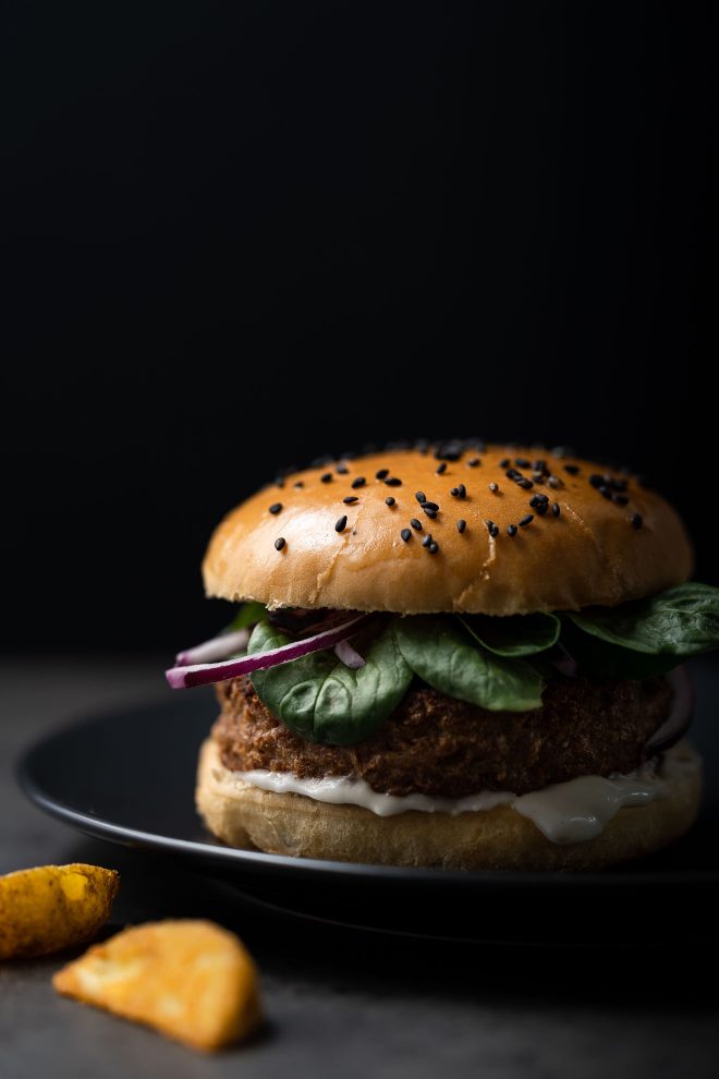
In this burger image, I’ve balanced the burger itself with some “empty” space, and some space filled with other elements. All of this, whether empty or not is the negative space in the image (ie. all of the space around the hero). The extra elements in this photo (the plate and extra potato wedges) complement the hero, without competing with it, providing context for the image as what might be served with the burger.
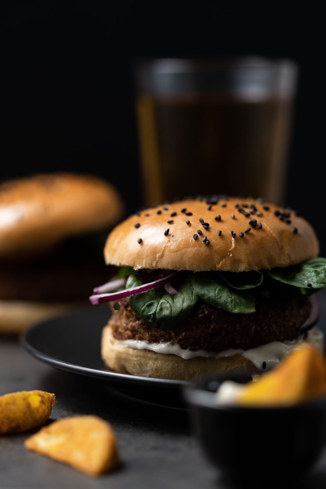
Whereas in this image, the other elements in the frame are definitely competing with the hero burger. It’s not that including these elements in the photo is wrong, but their positioning and dominance in the frame takes impact away from the hero. Particularly the beer glass sticking out the top of the burger, and the black bowl with the wedges in the front right corner.
Want a free kit to help you plan better, more professional compositions? Snag your free copy of my composition planning kit to get started!
Free Resource

Stop guessing and start implementing with my foolproof composition system. Elevate your food photography from good to great with composition techniques.
An Inverted World
As a photographer you must train yourself to see negative as positive, and vice versa. However, this is more a state of mind than a photographic technique. In fact, in order to do this, you don’t even need a camera.
Try it now. Or next time you’re walking around; or sitting on a bus; or wherever. Look at your immediate environment. Try to identify what you feel are the negative and the positive elements of the scene. Imagine the positive elements – the “things” – as solid little islands, while thinking of the space around and between these objects as a void, a black hole, nothingness.
Now flip the image. Invert it so that the islands are holes and the vacuum becomes solid ground. Notice the shape of the “spaces.” If you want to excel in photographic composition, this way of viewing the world needs to become second nature to you.
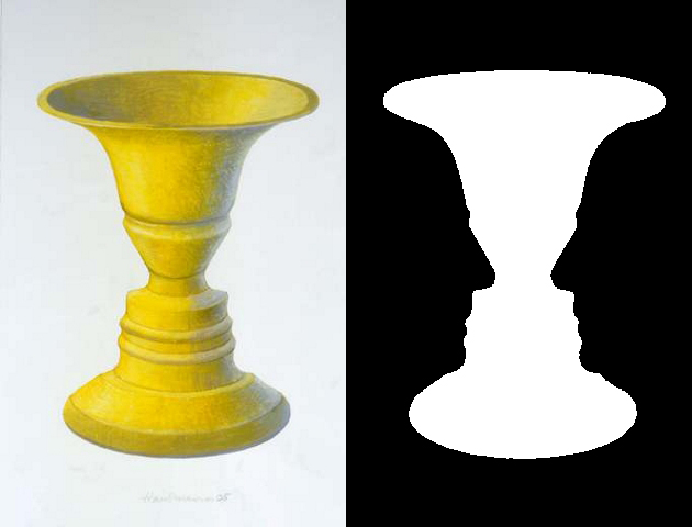
If you find this exercise difficult at first, try looking at a photograph instead. Ideally one with a simple and graphic composition. Overhead food photography is particularly good for this, as the conceptual difference between the foreground (food, dishes, cutlery, props etc.) and background (tabletop, shooting surface) is very obvious.
In order to help you plan your compositions with both positive and negative space, I’ve created you a free composition planning kit. You can print this out and use it to make a draft of where the main elements in your frame will go, then you can easily view the negative space too.
Free Resource

Stop guessing and start implementing with my foolproof composition system. Elevate your food photography from good to great with composition techniques.

Thanks for the critical analysis! There’s more to negative space than merely unoccupied space like some erroneously share.
It is a creative composition that requires keen vision, and for which I often find opportunity for.
*unoccupied space that gets equal or even more attention