Creative composition techniques aren’t always simply about producing a more visually stunning photograph, but also one that tells a subtly different story. Beyond classic composition techniques such as the rule of thirds, there are actually numerous lesser-known ones that can add greater interest to your photographs while also suggesting a more complex narrative.
In this article I’m going to tell you about three creative composition techniques that I regularly make use of in my own photography, in the hope that they’ll also inspire you in yours!
Related Post:How To Use Compositional Techniques To Improve Your Food Photography Composition
Fancy watching this instead? Check out the video below!
Diagonals
Anyone who has ever shot architectural or interiors photography will understand the importance of getting vertical and horizontal lines parallel with the edge of the frame. Sound advice, but what about the diagonals?
While often overlooked, clever use of diagonal lines can transform a standard and predictable image into one that is fresh and surprising: making this one of my favorite creative composition techniques.
There’s something about diagonal lines that just seems to add a lot of movement and energy to a shot. While a nicely squared-off composition will feel clean and organised, it can also come across as a little static and tame. Incorporating diagonal lines into a scene will help to liven up the composition by adding a greater sense of dynamism.
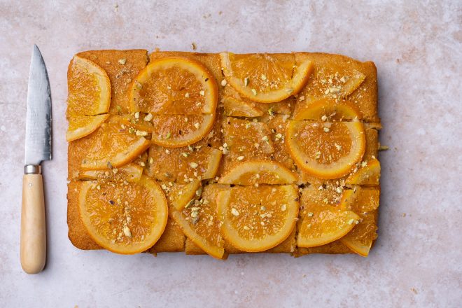
This orange cake photo is square and boring. All the lines are running parallel to the edges of the frame, giving the photo a static feel. Let’s see what happens when we throw in a few diagonals…

Just separating the slices slightly and creating some diagonals, leaning the knife off to the side adds movement and interest to this photo.
Often this technique works best when combined with more classical rules of composition, as this will help to anchor the movement created by the diagonals. For example, the shot of grilled artichokes below, strictly adheres to the rule of thirds in so far as the sauce dish sits at the meeting point between the lower and left-hand third-lines. Rather than interfering with the the composition, the diagonally placed spoon – and the edge of the roasting pan it intersects with – help to break up the predictable nature of the thirds. At the same time though, the diagonals also reinforce the importance of the thirds by drawing the eye towards the sauce dish.
Related Post: Improve Your Food Photography Composition in 15 Minutes Using The Rule Of Thirds
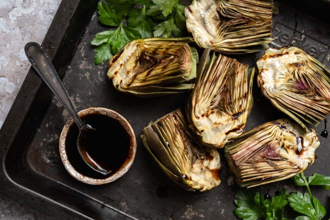
In addition to adding movement, diagonals can also be useful for connecting distant or unrelated objects in a frame, and for breaking up the one-dimensional monotony of predictable symmetry and repeat-patterns such as stripes.
Decentering
Many people’s first instinct when taking a photo is just to point the camera directly at the subject – placing it in the centre of the frame – and then press the shutter. It’s a legitimate enough tactic, and leaves the viewer in no doubt as to what the subject of the photo is. But let’s just say that it’s not one of the most creative composition techniques open to us as photographers.
In some ways, a totally centered shot is the photographic equivalent of just pointing a finger and saying “look at this!” It certainly does the job, but it leaves very little to the viewer’s imagination. Depending on the kind of shot you’re going for, moving your framing off centre – and perhaps even partially cropping the subject out of shot – can result in a more unexpected and visually intriguing composition.
What’s more, because a partially cropped subject will help to draw the viewer’s gaze out of the frame, this often results in a composition that suggests a narrative beyond the confines of the photo itself.
In order to successfully achieve an asymmetrical composition of this kind, you’ll need to keep two important points in mind. Firstly, just because the main subject is not in the centre of the photo doesn’t mean that it should no longer be considered the “hero” dish. Be careful not to confuse the viewer by allowing any secondary dishes or props to compete with your subject.
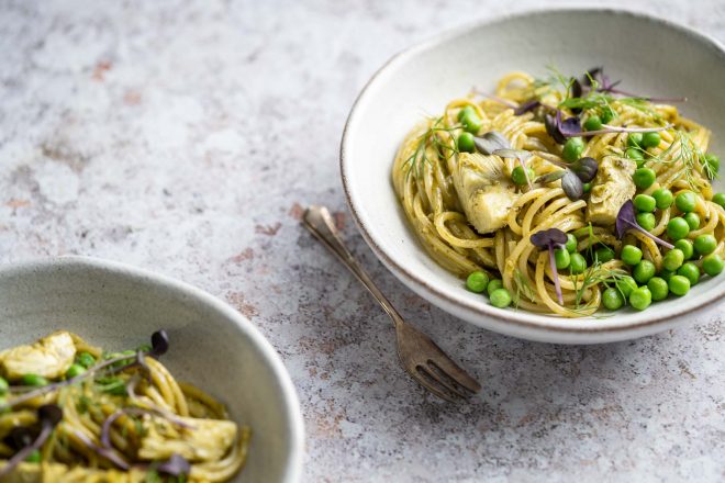
For example, in the image above there are two identical plates of pasta. Yet viewers will be in little doubt which of the dishes they should look at first. This is because the hero dish on the right is sharply focused, while the one on the left is somewhat blurred due to the shallow depth-of-field.
Not only this, but while the right hand plate is decentred, and has been partially cropped out of the frame, it nonetheless features much more prominently than the plate on the left – only a small part of which is included in the shot. The addition of a fork next to the right-hand dish further underlines its importance (imagine if instead the fork was next to the plate on the left).
The second thing to consider here is that shifting the subject off to one side of the frame will likely upset the balance of the composition. While the use of negative space (see below) is another great creative composition technique, in this particular case just leaving the left side of the image empty would likely not have resulted in a very interesting shot.
Instead, by showing part of a second dish to the lower left – echoing the hero dish to the upper right – the composition becomes balanced again. Yet, as much less of the dish is included on the left of the frame than on the right, the shot retains a pleasing degree of asymmetry.
In this case the main subject on the right of the frame, and the balancing element on the left, are both plates of pasta. Yet in order for a decentred composition to work, it is by no means necessary that you use two similar objects. In fact this shot might have been equally successful if, rather than the second plate of pasta, there was instead a side dish or some cutlery placed on the left. What’s important is that the balancing item’s position roughly mirrors that of the main dish, but without ever competing with it for the viewer’s attention.
Negative Space
You can’t travel far into the world of online photography without coming across photojournalist Robert Capa’s famous quote that “if your photos aren’t good enough, you’re not close enough.” There’s a lot to be said for only including the most essential elements in the frame, and many beginner photographers would do well to crop tighter, and then tighter again, if they want to improve their composition skills.
And yet there’s also a strong argument for giving certain images greater room to breath by incorporating large expanses of negative space into the frame. This isn’t to say that you should just go loose and sloppy in your compositions. On the contrary, good use of negative space can often lead to compositions that are more, rather than less, powerful and graphic.
In our daily lives, just as much as in photography, we tend to focus our attention on just a few specific items. What’s more, we often view these objects as if they were isolated islands; largely ignoring everything that lies between them. We look at the sky and we see a bird flying against an empty background; not the shape of the sky wrapped around a bird. The first step in working with negative space, then, is simply learning to see it, as if it were an object itself. Only once you can see negative space, can you start to use it as a compositional element in relation to other objects within the frame.
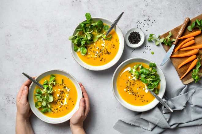
This shot of carrot and ginger soup might have worked just as equally well with a much tighter, Capa-esque composition – say cropping in to entirely fill the shot with the bowls. However it would have been a totally different photograph. As I ended up shooting it, the carrots, chopping board, and napkin on the right help to give closure to the image and frame the soup bowls, while the empty space to the top and left of the picture draw the eye down to the hero dish cupped by hands at the bottom.
My goal here was to add a degree of restraint to the composition, making the shot feel much cleaner and more elegant than if I’d simply filled the entire frame with the subject. Certainly anyone looking to produce more delicate or minimal looking shots will want explore the use of negative space.
Related Post: Instantly Improve Your Food Photography Composition Using The Rule Of Odds
Final Thoughts
It’s also important to remember that for composition rules to be effective, you really need to absorb them so that they become second nature. While a lot of images by your favorite photographers will likely fit some of the rules I’ve mentioned here – and more classic ones besides – in all likelihood these photographers were not thinking of any specific composition techniques when shooting. So rather than being something that you consciously refer to when composing your photos, the ultimate goal is for these composition techniques to become entirely instinctive.
Personally I find that the best method of achieving this is simply to look at a lot of well-composed photography, trying to figure exactly what it is that makes the composition so strong.
Ultimately, if you shoot a lot and often, and take time to look at other photographers’ work very closely, eventually you’ll start to develop creative composition techniques all of your own. Let me know in the comments which of these techniques you’re going to try in your work!

Thank you for these excellent tips! I’m a new food blogger and my photos are improving (still more to go), but it’s great to see how/why certain shots work better than others. Your posts and videos have all been extremely helpful!!
I’m so glad Julianne! It’s so exciting when you see your work improving