


One of the most important steps in any photographer’s food photo editing workflow is making basic colour adjustments. Along with simple changes to exposure and contrast, good use of colour can really make or break an image.
But professional colour editing isn’t about making a photo look like it’s been through a stack of novelty Instagram filters backwards. Instead, it’s an opportunity to get the most out of your image by making subtle but deliberate tweaks to its tonality, hue, and saturation.
In order to fulfil the potential of your photography, you need to know how to make skillful and informed use of Lightroom’s powerful colour editing tools. In this guide, the first in a series of posts on editing in Lightroom, I’ll show you exactly how.
Before we get started, are you using Lightroom Hotkeys? These keyboard shortcuts are going to help you work smarter not harder in your food photography. I’ve put together my favourite hotkeys for you in this handy PDF, get your free copy now!
White Balance
Before making changes to the colours of an image we need to be sure that we’re starting out on solid ground. If the white balance of your photo is already totally skewed before you even begin to edit, things are only likely to go downhill from there. And while you might get away with a bizarre white balance in some more arty genres of photography, in food photography it’s generally important that your photos remain as true to life as possible.
This is particularly the case when shooting for a client. Any image that veers too far away from reality could, at best, lead to disappointed customers, and at worst might potentially be considered misleading or dishonest advertising.
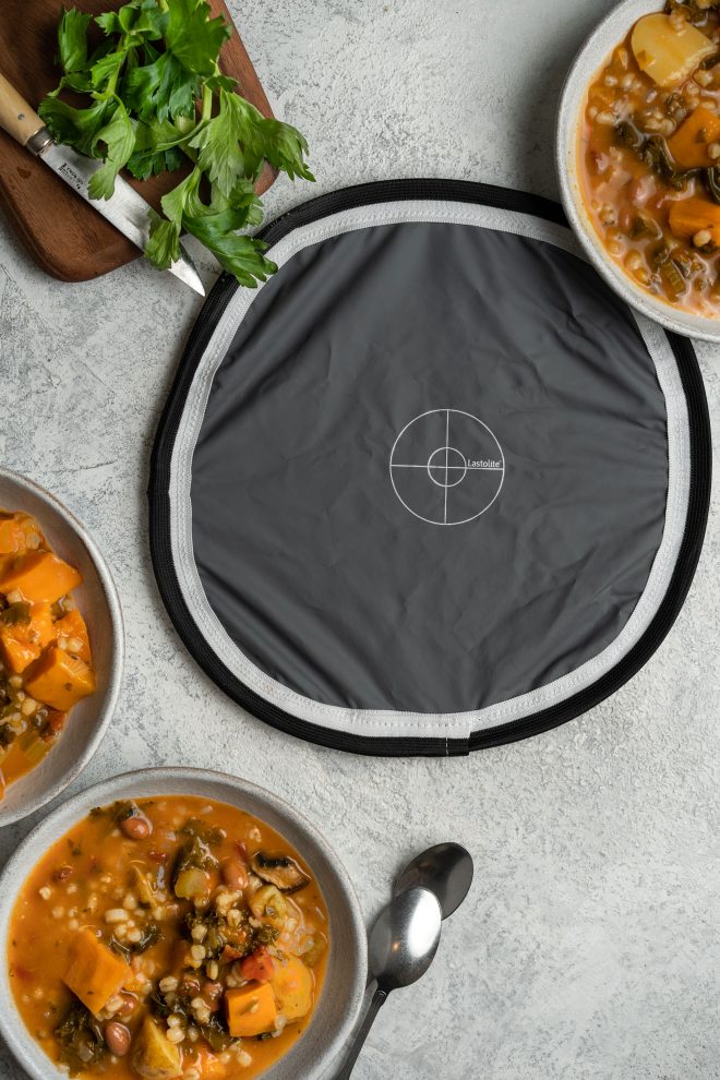
The first step in good colour management, then, begins long before the editing stage; taking a photo of your grey card/colour checker on-set under the exact same lighting conditions as your final shot.
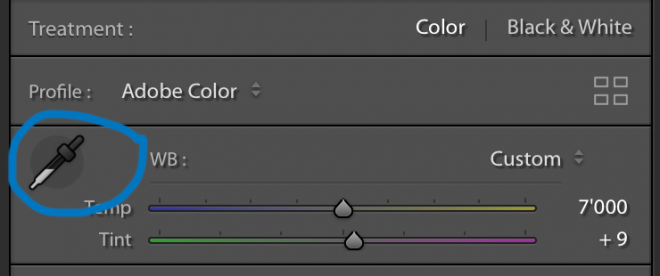
Once in Lightroom, pull up your grey card image and open the White Balance Selector by clicking on it (or using keyboard shortcut W). Grab the Dropper tool (circled in blue above) and sample a mid-grey from your colour checker card. Now Lightroom will automatically adjust the colour settings so that this becomes a totally neutral mid-grey, thus pulling all other colours into line too.
I still recommend having the final say by tweaking the colour balance yourself if necessary, but using Lightroom’s auto colour correct setting really speeds things up by getting you a good 90% or so of the way there first.
HSL: Yes. Vibrance/Saturation: No.
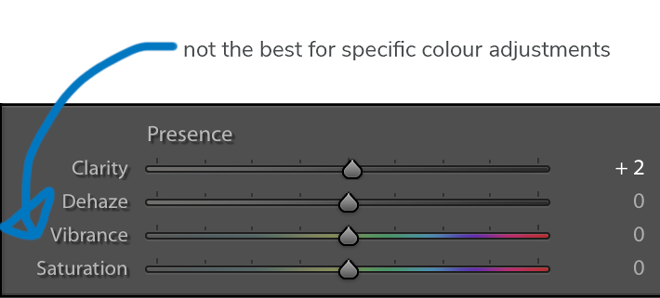
Good photo editing is about retaining full control over your image. Global adjustments will often change other areas of your image beyond merely those you wish to affect, so never make an adjustment to an image on a global scale if the same thing can be achieved with greater accuracy by making a localised adjustment instead.
In order to edit hue, saturation, and luminance in each colour independently, I strongly recommend using the HSL panel instead. In case you’re unsure about the precise meaning of these terms, here’s a quick recap:
- Hue refers to the particular tone of a colour. For example, red can vary between a pale orangey colour through to a bright crimson or a deep burgundy. The Hue slider allows you to choose what kind of reds are in your photo.
- Saturation refers to the intensity of a colour. A red can be very strong, or alternatively so dull that it’s almost a shade of grey. Increasing the saturation of a particular colour intensifies the amount of “pure” colour present in it.
- Luminance means the degree to which a colour is light or dark (the word luminance refers to light). This slider permits you to alter the shade of a colour from deep to pale, and vice versa.
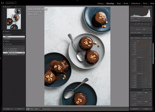
The advantage of the HSL controls is that they allow you to adjust the hue, saturation and luminance of different colours separately. So, for example, you can adjust the saturation and luminosity of just the reds, without altering any other colour in the photo. This is much more powerful than applying a global saturation and luminosity adjustment across the entire image.
For more in-depth advice on using the HSL controls, check out my previous article on Lightroom editing hacks here.
Calibration
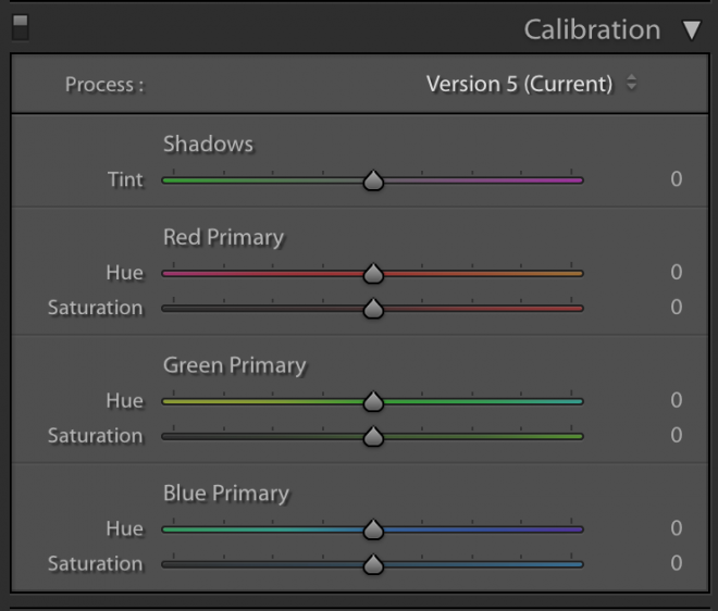
Lastly, I want to look at the Colour Calibration Controls. Although you won’t need to make use of these too often, they are nonetheless a very powerful tool that permits much greater control over your final image.
Humans perceive colours in the world when light bounces off of objects and reflects into our eyes. This light is then processed by the retina, which interprets it as separate colours depending on its wavelength. As all our bodies differ and there’s a degree of subjective interpretation going on here, it’s hard for us to be entirely sure that we are all seeing exactly the same colours.
As much as 8% of the male population (and a much smaller number of females) cannot process these colours in the same way as other people. We often call this colour-blindness.
Cameras work in a similar way. The main difference being that every make of camera (and frequently even many different models of camera from the same brand) interprets the varying wavelengths of light quite differently. As no particular camera manufacturer can claim to interpret colour correctly, you could almost say that all cameras are colour-blind, in that they each have their particular idiosyncrasies in how they render colour.
As I mentioned above, there are many kinds of red; from pale to deep; from yellowish to pinkish. Which of these reds is an “average” or “typical” red? Although the differences may be small, ask a group of people to identify a “true” red and they will likely argue over it until infinity. Given that cameras are designed by people, it’s fairly unsurprising that cameras also disagree on this matter. A basic red for a Fuji is not the same as a basic red for either a Canon or a Nikon.
There’s no guarantee that you will agree with your camera on this front either. Luckily though, when you import a RAW file into Lightroom, you have the option of telling the software exactly how you want it to interpret the colours in that file by adjusting the Hue and Saturation sliders for individual primary colours.
Calibration differs from the HSL controls in that by moving, say, the Red Primary sliders, you are not just adjusting red pixels within the file, but adjusting the red present in every one of the file’s pixels. For this to make sense, you need to appreciate that all colours of the spectrum are made up of a combination of red, green, and blue (RGB).
The Calibration Controls are not so much designed as a colour editing tool as they are meant to allow you to tell Lightroom how you want it to treat your RAW files from a certain camera.
Something you could do to make this process quicker for every import, is to adjust the calibration sliders how YOU like them, then create a Lightroom preset for just the calibration settings and apply this to every upload, allowing you to treat all your RAW files in the same way.
Phew… we made it. Want to make your Lightroom editing workflow easier and more efficient? You need to be using hotkeys. Want to grab my free Lightroom Hotkeys guide for food photographers? Get your free copy below!
Final Thoughts
The secret to good photo editing is making precise, controlled changes to an image only where you want them, without accidentally also making unwanted changes in other areas too. The three Lightroom colour adjustment tools that I’ve looked at in this post should be your starting point for all high-level colour editing.
Looking to step-up your food photo editing skills some more? Be sure to check back soon for the next installment in this series on editing food photography in Lightroom.
Like it? Share the love!