


“What even IS a histogram?! Do I need to care about it for my food photography?”
Not the most exciting of questions right? Understanding the science behind your photo will allow you to use this information to make more informed creative decisions.
When I started to consistently analyse my histograms, I knew that my photos were well exposed and had a consistent look in line with my style – yes, your histograms can help you understand your photography style.
These little graphs are actually very logical and easy to understand. Once you’ve nailed reading them, you’ll be amazed how much creative freedom it can unlock!
Histograms are a tool used in photography to determine the exposure of an image.
On the subject of exposure – the easiest way to have complete control over the exposure of your photo (and therefore the overall look) is to use manual mode!
If you haven’t yet taken the leap into using manual mode with your camera – fear not! I’ve written you a free 5-day e-course to get you started, it will show you EVERYTHING you need to know about manual mode, and you’ll soon be whizzing through those settings like a pro. Sign up for free below!

Free E-Course
Learn Manual Mode in 5 days flat!
Learn Manual Mode in 5 days flat!
Before we jump in, switch on the histogram preview on your camera if you have it available. It will instantly generate the histogram for your photo so you can look at it straight away and make any immediate tweaks to your exposure. And if you’d prefer to watch this in video format, check it out below.
The main reason why the in-camera histogram review tool is so useful is that it’s more accurate than the preview on the LCD screen of your camera. It’s hard to see every part of your photo in detail on a live view screen, and therefore you might miss small blown-out highlights.
But the data doesn’t lie… a histogram will show you straight away if you’ve got any blown-out highlights or underexposed areas… let’s take a look!
What is your camera’s histogram?
A histogram is a graphical representation (in a bar graph) of the tonal range of your photo. It looks a little something like this:
The X-axis denotes the tones in your photo, going from left to right as follows:
Pure Black → Shadows → Midtones → Lights → Pure White</p
Quick definition: Tonal range = The number of visible tones in a photo, between the darkest and lightest points of your photo (the shadows and the highlights).
There are 255 possible tones in your photo, where 0 = complete black and 255 = complete white. The height of each column on the Y-axis is determined by how many pixels are in that column. In the example above, most of the pixels fall in the “lights” section of the histogram.
The bars on a histogram are squished together with no space between them, which gives a histogram a fluid, almost hand-drawn look.
A colour photography histogram is made up of three graphs on top of each other – blue, green and red. Where they all overlap, the graph looks grey, and where only 2 overlap, it looks cyan, yellow or magenta.
Learning how to read your histogram is useful in your food photography, because as you shoot more and more and develop your style, you will probably start to see consistency in your histograms. You’ll see your histograms leaning to the right hand side if you go for brighter, lighter photos, and to the left if you’re into dark, moody photos.
Comparing Histograms as you shoot can help you develop consistency in your work which will help you develop your signature look!
There is no “right” or “wrong” shape for a histogram. You will often an example of a “good” histogram explained as all the tones falling between the left and right – but this idea is actually completely subjective, as we just talked about above.
You have to remember that photography is an art, not a science (ok, maybe it’s a BIT science 😉 ). You should use your histogram as a tool to help you improve your photography, not as a rule that you feel restricted by.
Clipping
One of the most useful features of a histogram is to show you “clipped” areas. Clipped areas are where there any many tones sitting on the “0” and “255” values on the x-axis (a.k.a – pure black and pure white). These clipped areas look like spikes up the sides of a histogram, like this:
The parts of the graph sitting right on the extreme right and left (that look like they’ve been smooshed up the side) represent data loss in those parts of the image. Those pure black and pure white tones can’t be recovered in post-production editing, so they are lost forever (sad face).
Your camera’s sensor is not as advanced as the human eye, and it can only pick up those 255 tones. Your eye can pick up many, many more!
Side note: If you’re shooting in raw format, you do have a little more flexibility. The histogram your camera produces is based on the JPEG version of your photo, rather than the raw version. The JPEG version is only in 8-bit, whereas the raw file is either 12-bit or 14-bit, so you may find you can recover more of the data by shooting in raw.
Related: Raw Format: How to TRANSFORM your food photography with this one simple camera setting
As I mentioned above, there is no “ideal” shape for a histogram, so when it comes to clipping, it’s not always bad. Depending on the subject you’re shooting, and the effect you’re going for, you may find that your photo looks perfect even with the histogram showing some clipping. So as I mentioned above, use it as a tool to guide you, rather than trying to achieve a histogram with no clipping just for the sake of it.
A lot to take in? Don’t worry, we’ve got a quick knowledge check quiz later on in this post! Let’s take a look at some examples…
Examples of histograms in food photography
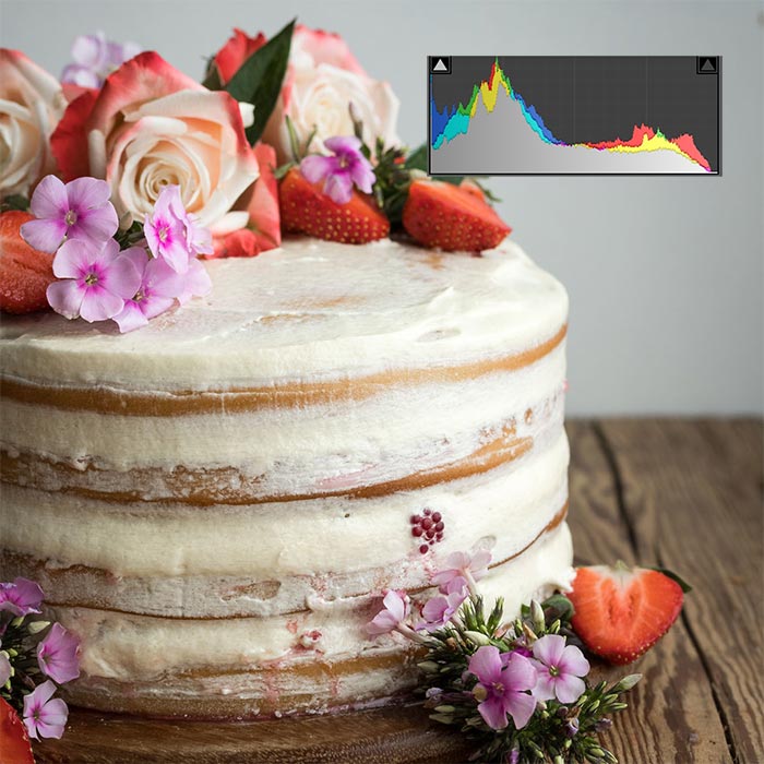
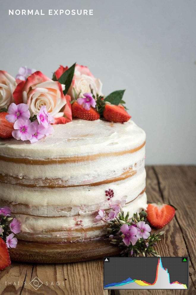
In this example, you can see from the histogram that all of the tones fall within the range of the graph. There is no major “clipping” on either end, which suggests a “good” exposure.
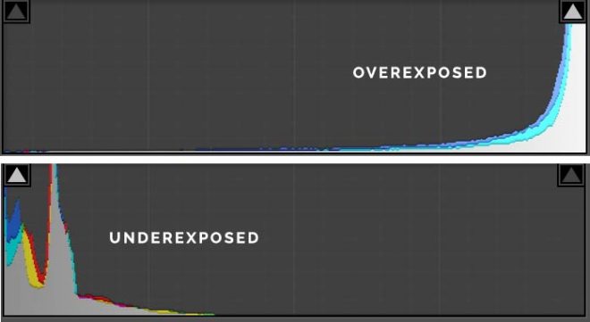
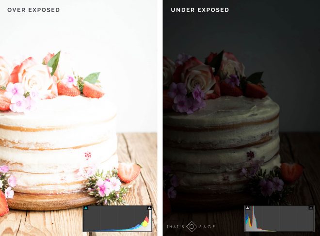
In the next examples of the same photo, you can clearly see that they are over and underexposed. This is reflected in the histograms. In a live shooting situation, I would see these histogram previews and know that I had plenty of wiggle room to adjust my exposure up or down and still capture all the tones.
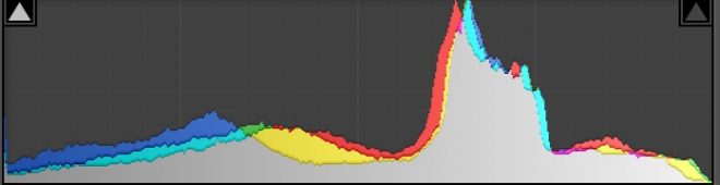
In the image below we have a pretty high contrast scene. There’s a window flooding in bright daylight, and very dark foreground, which creates high contrast.
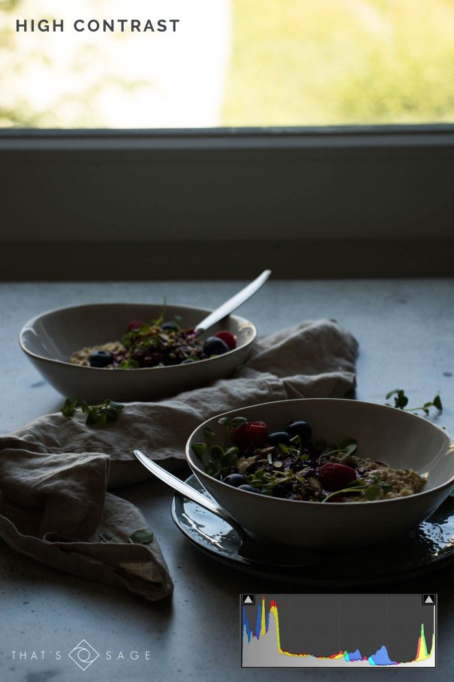
In this situation, the histogram takes on more of a “U” shape, where most of the tones are falling at the extreme darks and lights, with only a few in the mid tones.
I would use the histogram preview for this photo to know that I need to create more mid tones by adding a reflector or another light source at the front, then adjusting the exposure accordingly.
Knowledge Check!
Now we’ve looked at the anatomy of a histogram and a few food photography examples, let’s do a FUN knowledge check! Yes, it is fun! 😀
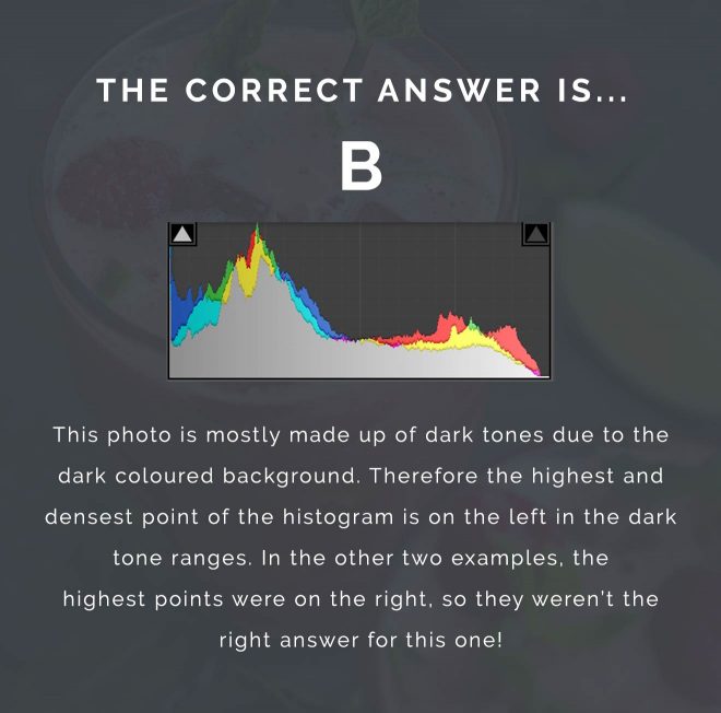
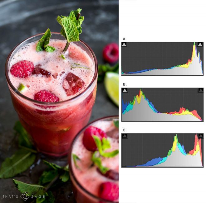
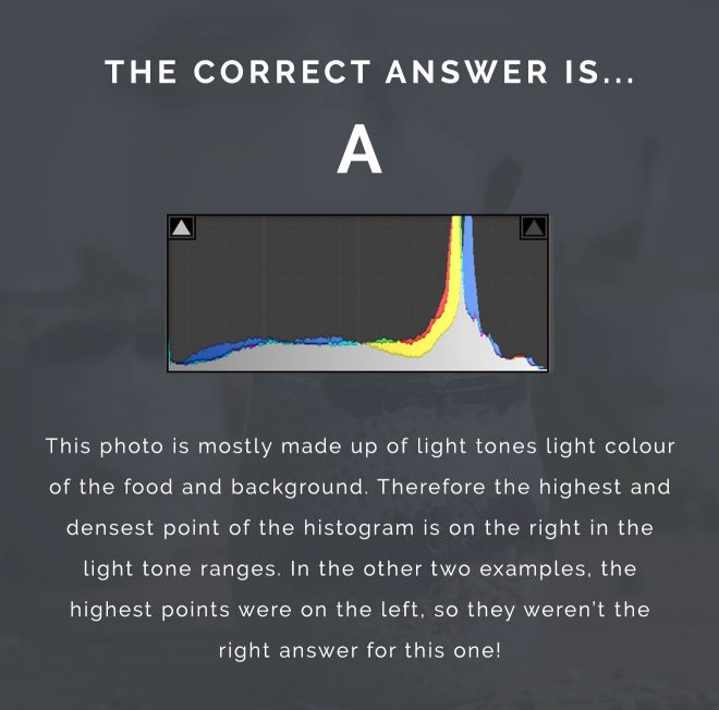
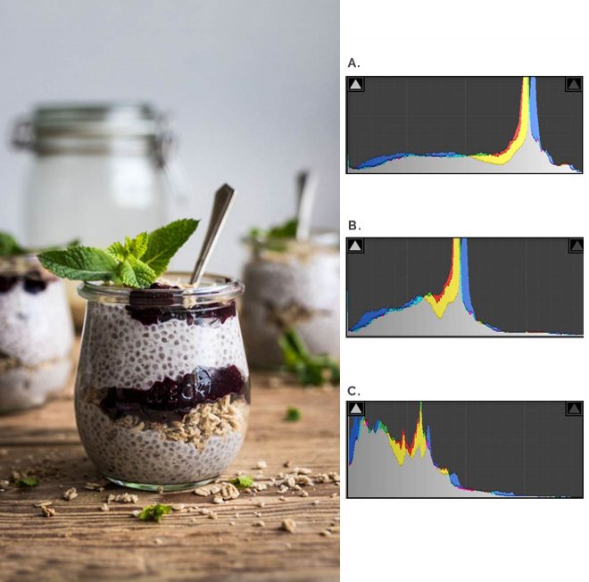
Have a look at the photos below: for each photo there are 3 histograms to the right – only one of them is correct!
See if you can identify which histogram goes with each photo.
Remember – more dark tones = a left weighted histogram and more light tones = a right weighted histogram.
Once you’ve chosen, press “show me the answer” to see if you’re right!
Question 1:
Question 2:
Summary
- A histogram is a graphical representation of the tones in your photo in a bar graph format.
- The x axis goes from 0-255 and shows the number of tones able to be picked up by your camera’s sensor.
- The graph goes from pure black → pure white, from left to right.
- The height of each bar is determined by the number of pixels in your photo that fall in that tone.
- “Clipping” is the term used for tones that fall in the “pure black” or “pure white” range. The data in these areas is lost and cannot be recovered in post-production. Depending on what kind of photo you are trying to shoot, you could adjust your exposure in camera accordingly.
Your Turn
Try turning on the histogram preview in your camera and use it to help identify the kind and style of pictures you’re taking. When you take pictures you particularly like, check out the shape of the histogram and see if you can replicate that look in the future.
Thank you! Very usefull post.
Hi Lauren! Nice post, an interesting way to explain the histogram.
Nice post, Lauren! Thanks for the histogram refresher.